1/7

2/7

3/7

4/7
5/7
6/7
7/7

032
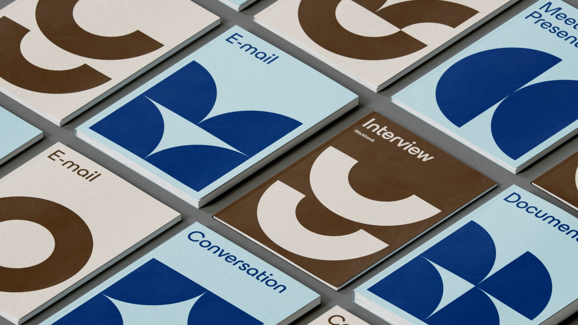
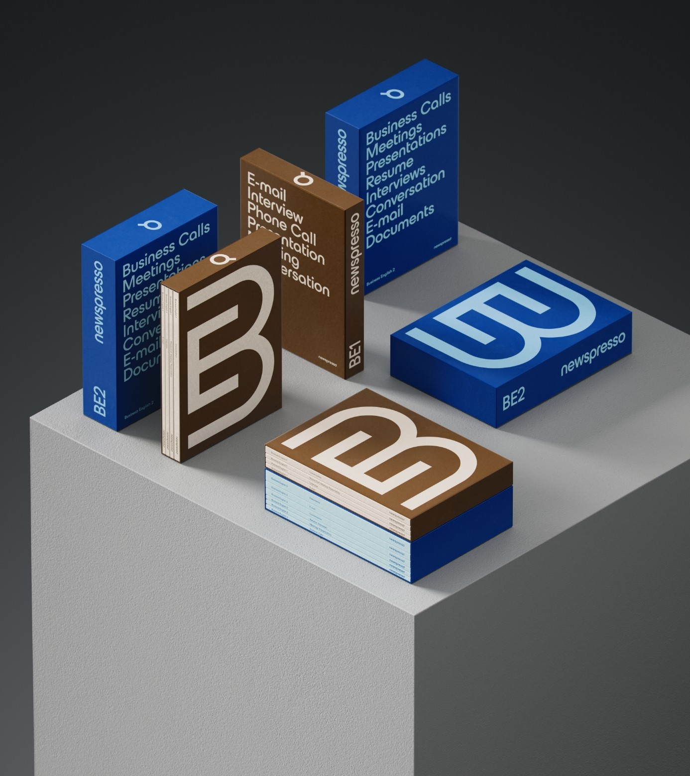
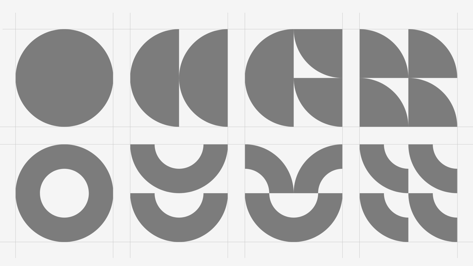
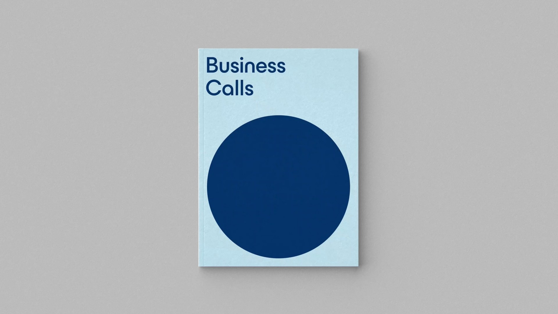
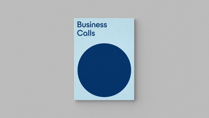
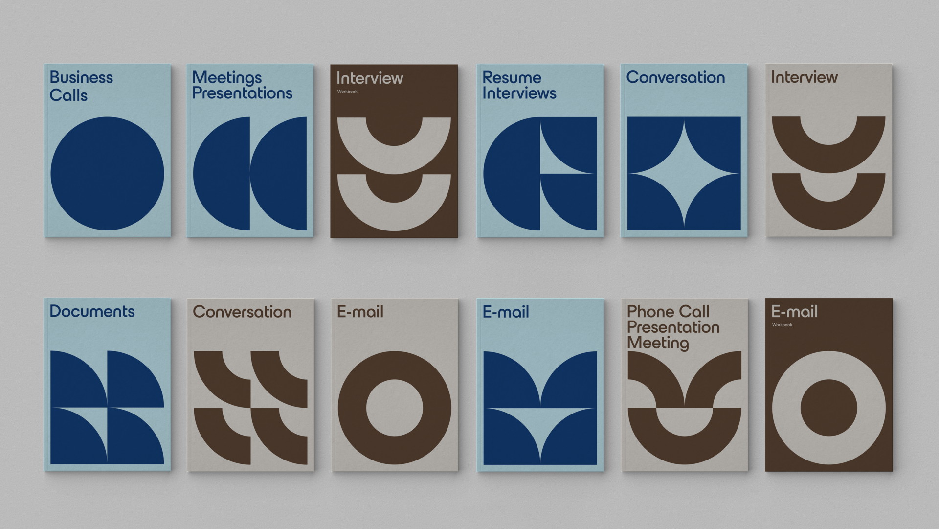
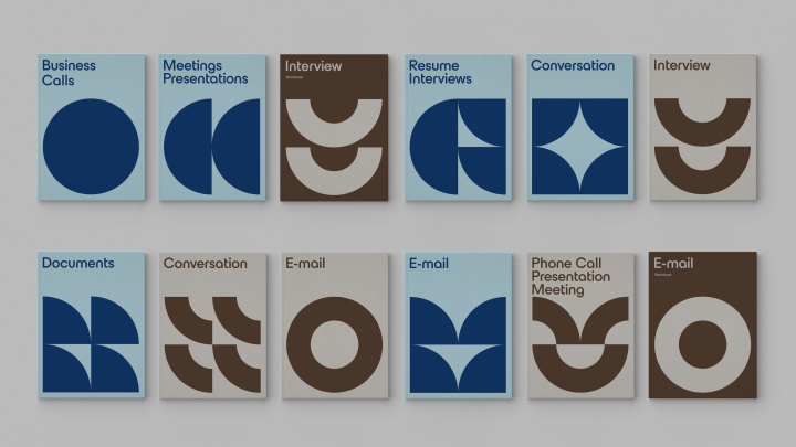
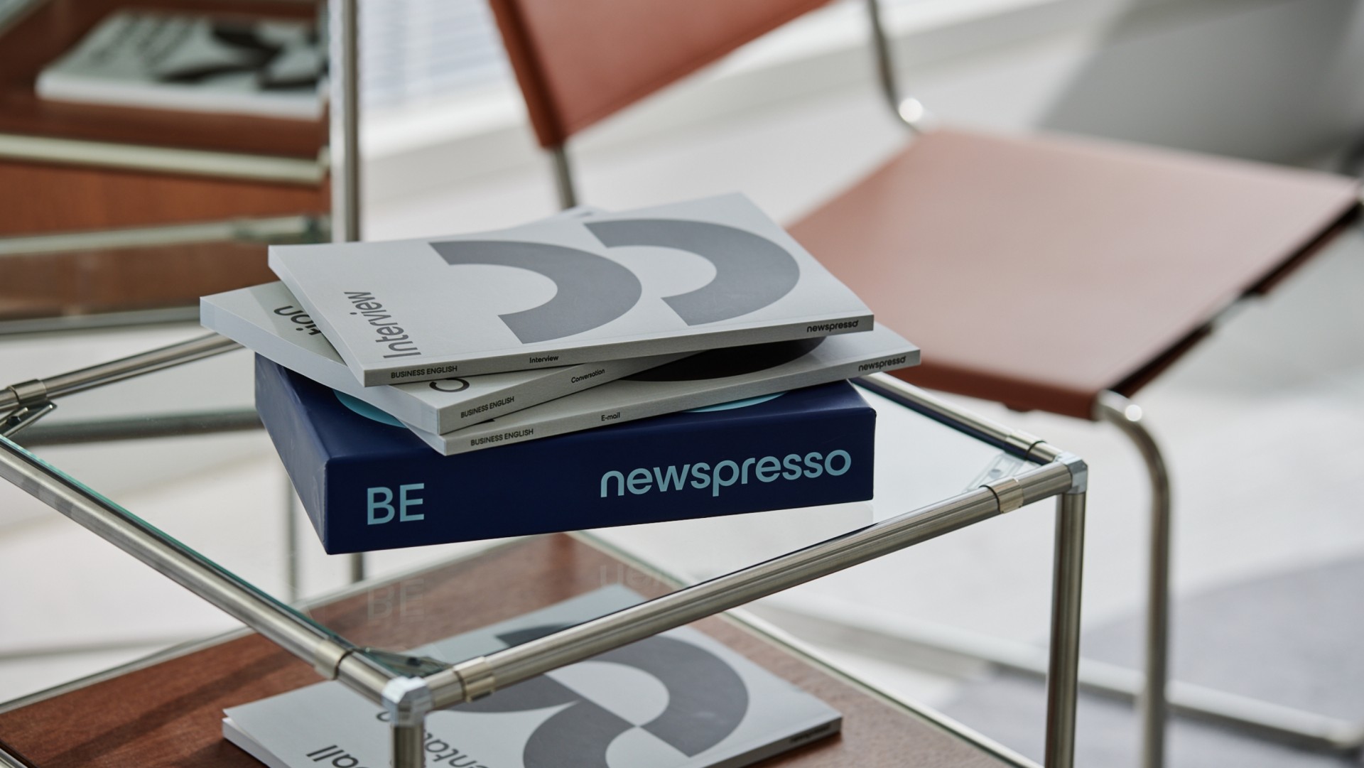
Redesign of book covers and packaging for the Business English line, a sub-brand of the South Korean company Newspresso. The products are aimed at learning English with a focus on business. The solution involved creating a cover system based on the circle, which references the typography used in the brand that features rounded finishes. The circle is utilized in an integral and deconstructed way as the user progresses through the levels. For the packaging, we created a typographic symbol that evokes the letters B and E, enhancing immediate brand recognition.
- Client
- Graphic Design
- Design
- 3D
- Typography


