


029
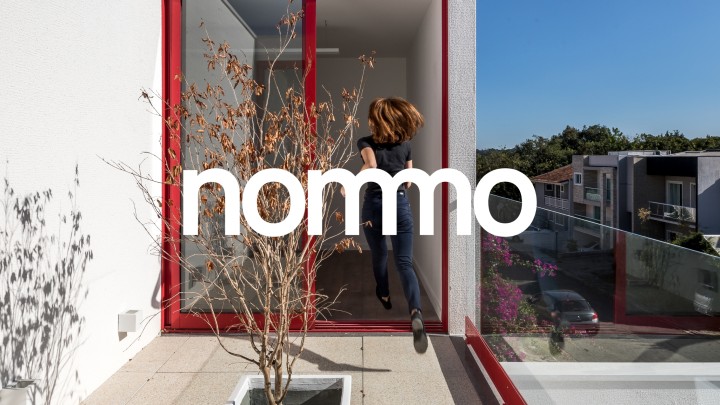
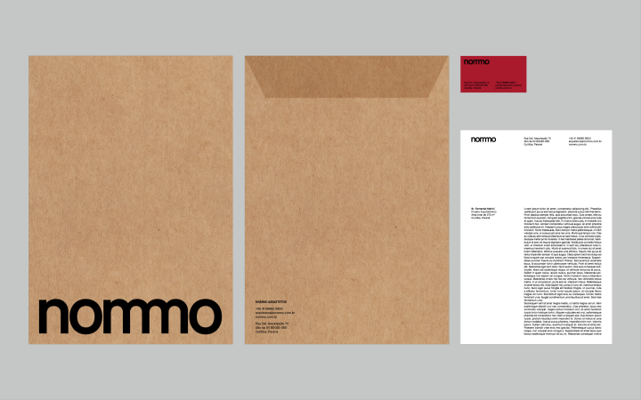
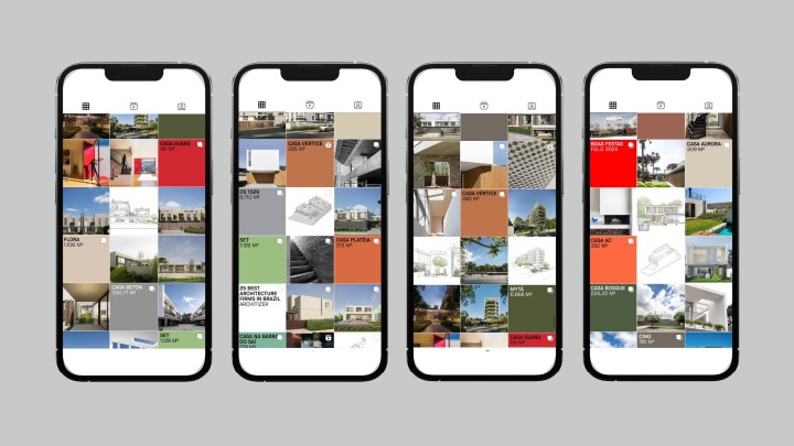
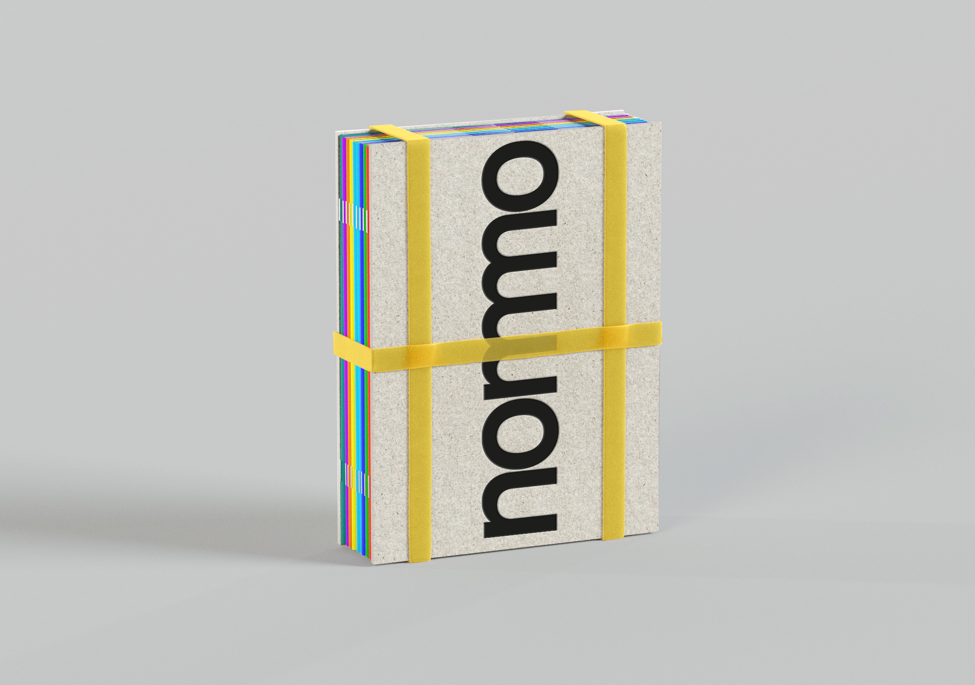
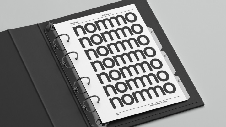
The new visual identity of the architecture firm nommo reflects a moment of evolution in its trajectory, marking a more mature and contemporary positioning after seven years of operation. The logo is the central element of this identity, created to symbolize the firm's activities and goals. The brand is based on the combination of the letter "m," with the overlap of characters forming a unique design that highlights the close relationship between the firm and its clients. The graphic system of the identity uses the repetition of the logo as an important graphic element, reinforcing the concept of presence and occupation in the city. The colors associated with each project bring balance and clarity to the graphic applications, complementing the design and functionality of the visual identity. This approach ensures that the new identity conveys a cohesive character aligned with the firm's contemporary and innovative vision.
- Client
- Graphic Design
- Design
- Typography


